

A responsive design website automatically adapts its layout, media, and typographic scale to match the user’s device and viewport, using three core techniques: fluid/flexible layouts, CSS media queries, and responsive media (images, video, and typography). According to MDN’s definition of responsive web design, it is not a single technology but a set of best practices that work together to serve one codebase across every screen size.
A responsive site solves three immediate problems:
- Usability — content reads and functions correctly on any device without horizontal scrolling or pinch-zooming to read text.
- Single codebase — one URL, one set of templates, one place to push updates.
- SEO — Google’s mobile-first indexing rewards responsive sites and avoids the duplicate-content penalties that separate mobile URLs can create.
Key takeaways
A responsive design website uses fluid layouts, CSS media queries, and responsive media to serve one codebase correctly across every device, with the viewport meta tag and mobile-first CSS as the essential starting points.
| Point | Details |
|---|---|
| Core definition | A responsive site adapts layout, media, and type to any viewport using fluid grids, media queries, and responsive images. |
| Viewport meta tag | Place width=device-width, initial-scale=1.0 in <head> on every page — without it, mobile browsers ignore your media queries. |
| Mobile-first CSS | Write base styles for small screens and add min-width queries; this keeps the initial CSS footprint small and improves mobile performance. |
| Touch and accessibility | Interactive elements need at least 48×48 device-independent pixels; never disable pinch-to-zoom. |
| Test before sign-off | Run Chrome DevTools device toolbar and Lighthouse across common viewport widths before every delivery. |
Three actions you can take right now:
- Add the viewport meta tag to any page that is missing it and verify your media queries fire correctly.
- Run a Lighthouse audit on your current site and address any accessibility or performance flags.
- Use the WordPress Profit Calculator to see what your agency’s existing WordPress clients represent in recurring revenue.
Table of Contents
- What does a responsive design website actually mean in practice?
- The three technical pillars: fluid layouts, media queries, and responsive media
- How Flexbox and CSS Grid make responsive layouts practical
- How to handle images and media responsively
- Making typography responsive across every viewport
- Why the viewport meta tag is non-negotiable
- Step-by-step checklist for making a site responsive
- How to test whether your site is truly responsive
- Accessibility and performance for responsive sites
- Practical layout patterns you can copy right now
- Managing responsive WordPress sites at scale: an agency perspective
- A field-tested perspective on responsive delivery
- Sources
What does a responsive design website actually mean in practice?
The term “responsive web design” was coined by Ethan Marcotte in a 2010 A List Apart article, where he proposed combining fluid grids, flexible images, and media queries into a single unified approach. Before that, the common solutions were either a separate m. subdomain (a parallel site to maintain) or a native app (expensive, platform-specific, and invisible to search engines).
A responsive site uses a single HTML markup that the browser renders differently depending on viewport width. The server sends the same document to a phone and a desktop; CSS does the work of rearranging columns, resizing images, and adjusting type. MDN’s responsive web design guide describes this as fluid grids and flexible images controlled by media queries.
How the three approaches compare:
- Responsive site — one codebase, one URL, adapts via CSS. Lower maintenance cost, good SEO, works across all viewports including sizes you never explicitly designed for.
- Separate mobile site — a parallel codebase at a different URL. Higher maintenance burden, duplicate-content risk, and users on tablets often land on the wrong version.
- Native app — best for complex interactions and offline use, but requires platform-specific development, app-store distribution, and does nothing for organic search discovery.
For most UK businesses, responsive design is the practical default. It provides flexibility, lower long-term cost, and fewer technical risks than adaptive or app-only approaches in the majority of cases.
The three technical pillars: fluid layouts, media queries, and responsive media
These three techniques are what make a site genuinely responsive rather than merely “mobile-friendly.”
Fluid layouts
A fluid layout uses percentage-based or relative widths rather than fixed pixel values.
.container {

  max-width: 1200px;
  margin: 0 auto;
  padding: 0 1rem;
}

.column {

}
Fluid layouts handle the space between your explicit breakpoints, so layouts do not snap awkwardly at intermediate sizes.
Media queries
Media queries let you apply CSS rules only when the viewport meets a condition. The mobile-first pattern writes base styles for small screens, then adds min-width queries to layer in complexity as the viewport grows.
/* Base — small screens */
.card-grid {
  display: grid;
  grid-template-columns: 1fr;
  gap: 1rem;
}

/* Tablet and up */
@media (min-width: 48rem) {
  .card-grid {
    grid-template-columns: repeat(2, 1fr);
  }
}

/* Desktop */
@media (min-width: 75rem) {
  .card-grid {
    grid-template-columns: repeat(3, 1fr);
  }
}
Add a new breakpoint only when the content breaks, not at arbitrary device widths. Web recommends letting content dictate breakpoints rather than targeting specific device models.
Responsive media
Images and video need explicit handling or they will overflow narrow containers or serve desktop-sized files to phones.
<img
  src="hero-800.jpg"
  srcset="hero-400.jpg 400w, hero-800.jpg 800w, hero-1600.jpg 1600w"
  sizes="(max-width: 48rem) 100vw, 50vw"
  alt="Agency team at work"
  width="800"
  height="533"
  loading="lazy"
/>
The srcset attribute lists candidate files and their intrinsic widths; sizes tells the browser how wide the image will be rendered at each viewport. The browser picks the most appropriate file.
| Technique | What it controls | When to use it |
|---|---|---|
| Fluid layout (%) | Column widths and container sizing | Always — the foundation of every responsive build |
| Media queries | Layout changes at breakpoints | When fluid alone cannot handle the shift |
srcset / sizes |
Which image file the browser downloads | Every <img> that is not a fixed-size icon |
<picture> element |
Art direction (different crop per viewport) | Hero images where composition changes |
clamp() typography |
Font size scaling between min and max | Headings and display text |
Pro Tip: Combine all three techniques. Start with a fluid layout so intermediate sizes work without extra queries, add min-width media queries only where the content genuinely breaks, and always pair srcset with explicit width and height attributes to prevent layout shift.
How Flexbox and CSS Grid make responsive layouts practical
Modern CSS layout systems remove most of the float-and-clearfix hacks that made early responsive work painful. MDN explains that flexible grids are the foundation of responsive work, and Flexbox and Grid are the tools that deliver them.
Flexbox is one-dimensional: it arranges items along a row or a column. Use it for navigation bars, button groups, card rows, and any component where items need to wrap or align along a single axis.
.nav {
  display: flex;
  flex-wrap: wrap;
  gap: 0.5rem;
}
At narrow widths, flex-wrap: wrap lets items drop to the next line automatically, no media query required for basic wrapping.

CSS Grid is two-dimensional: it controls rows and columns simultaneously. Use it for page-level layouts, card grids, and any component where you need explicit placement in both axes.
.page-layout {
  display: grid;
  grid-template-columns: 1fr;
  gap: 1.5rem;
}

@media (min-width: 60rem) {
  .page-layout {
    grid-template-columns: 16rem 1fr;
  }
}
A few practical points:
- Use
auto-fillorauto-fitwithminmax()for card grids that reflow without any media queries:grid-template-columns: repeat(auto-fit, minmax(16rem, 1fr)); - Flexbox handles alignment within a Grid cell cleanly — nesting the two is safe and common.
- Avoid mixing Grid and Flexbox on the same element; apply Grid to the parent container and Flexbox to child components.
How to handle images and media responsively
Serving the right image to the right device is one of the highest-impact performance decisions in a responsive build. A 2,400 px wide hero image downloaded on a 375 px phone wastes bandwidth and slows the page.
srcsetandsizes— use on every content image. Thesizesattribute is the key: it tells the browser the rendered width of the image at each viewport so it can calculate which source to fetch before layout is complete.<picture>element — use when you need art direction (a portrait crop on mobile, a landscape crop on desktop) or to serve a modern format with a fallback:
<picture>
  <source type="image/avif" srcset="hero.avif">
  <source type="image/webp" srcset="hero.webp">
  <img src="hero.jpg" alt="Agency team" width="1200" height="800" loading="lazy">
</picture>
- AVIF and WebP — both offer significantly smaller file sizes than JPEG at equivalent quality. AVIF has the better compression; WebP has broader legacy support. Serve AVIF first with a JPEG fallback via
<picture>. - Lazy loading — add
loading="lazy"to any image below the fold. The browser defers the request until the image is near the viewport. - Prevent layout shift — always include
widthandheightattributes on<img>elements, or setaspect-ratioin CSS. Web.dev’s guidance specifically flags this as a way to avoid Cumulative Layout Shift (CLS), which affects Core Web Vitals scores. - Delivery — generate multiple sizes at build time (Sharp, ImageMagick) or use a CDN with on-the-fly resizing (Cloudinary, Imgix). For WordPress sites, plugins such as Imagify or ShortPixel handle this automatically.
Making typography responsive across every viewport
Typography is often the last thing developers make responsive and the first thing users notice when it is wrong. A heading that reads well at 1,440 px can feel enormous on a 375 px phone if you only set it in pixels.
Unit choices:
rem— relative to the root font size. Use for font sizes and spacing to respect the user’s browser preferences.em— relative to the parent element’s font size. Useful for component-level spacing that should scale with its context.vw— a percentage of the viewport width. Useful for display headings, but always clamp it to avoid text becoming unreadably small or large.
Fluid type with clamp():
h1 {
  font-size: clamp(1.75rem, 4vw + 1rem, 3.5rem);
}
clamp(minimum, preferred, maximum) scales the font size continuously between the minimum and maximum values. No media query needed for the heading itself.
Measure (line length): Readable body text sits between 45 and 75 characters per line. Set max-width: 65ch on your body text container to enforce this regardless of viewport width.
- For body copy, set a base size in
remand letclamp()handle display headings. - Change font sizes at breakpoints only when the layout shift justifies it (for example, a sidebar appearing that narrows the content column).
- Adobe’s responsive design guidance notes that mobile users often want quick-scan content while desktop users are in a longer-read mindset — adapt line length and spacing accordingly, not just font size.
Why the viewport meta tag is non-negotiable
Without the viewport meta tag, mobile browsers apply a virtual viewport (typically 980 px wide) and scale the page down to fit the screen. The result looks like a zoomed-out desktop site — unreadable without pinching.
The standard tag:
<meta name="viewport" content="width=device-width, initial-scale=1.0">
width=device-width— sets the viewport width to the device’s actual screen width in CSS pixels.initial-scale=1.0— prevents the browser from applying a default zoom level.
Web.dev explains that this tag is the prerequisite for mobile-first CSS to work correctly. Without it, your media queries fire at the wrong widths.
What to avoid:
user-scalable=noormaximum-scale=1— these disable pinch-to-zoom. The NHS / NICE design system explicitly flags this as an accessibility anti-pattern. Users with low vision rely on zoom; disabling it fails WCAG 1.4.4 and excludes a significant portion of your audience.- Setting
widthto a fixed pixel value — this defeats the purpose of responsive design entirely.
The viewport tag belongs in <head> on every HTML page, before any CSS link elements.
Step-by-step checklist for making a site responsive
Converting an existing fixed-width site or starting a new responsive build follows a consistent sequence. Work through these in order.
- Audit your assets — list all fixed-width containers, pixel-based font sizes, and non-responsive images. A browser devtools search for
pxin your CSS is a fast starting point. - Add the viewport meta tag — place
<meta name="viewport" content="width=device-width, initial-scale=1.0">in<head>before anything else. - Set a mobile-first base CSS — write styles for the smallest viewport first. Remove any
max-widthmedia queries and replace them withmin-widthqueries. - Convert fixed widths to relative units — replace
width: 960pxwithmax-width: 60rem; width: 100%. Use%for columns inside a container. - Make images responsive — add
max-width: 100%; height: auto;as a global rule, then addsrcsetandsizesto content images.
img {

  height: auto;
  display: block;
}
- Check touch targets — interactive elements (buttons, links, form controls) should be at least 48×48 device-independent pixels. The NHS / NICE design system sets this as a minimum for touch interfaces.
- Apply fluid typography — replace fixed
pxfont sizes withremand addclamp()for display headings. - Add progressive enhancement — verify that core content and navigation work without JavaScript. Forms should submit, links should navigate, and content should be readable before any JS runs. Gov recommends progressive enhancement alongside responsive design to provide consistent access across browsers and devices.
- Test at every breakpoint — resize the browser from 320 px to 1,600 px and fix anything that breaks, overflows, or becomes unreadable.
- Run Lighthouse — check performance, accessibility, and best-practices scores. Address any issues flagged before sign-off.
See the site redesign checklist for a broader agency-level workflow that wraps around these steps.
How to test whether your site is truly responsive
Building responsive is only half the job. Testing confirms it works across the real range of devices your users bring.
Tools:
- Chrome DevTools device toolbar — press F12, toggle the device toolbar (Ctrl+Shift+M), and drag the viewport width from 320 px to 1,600 px. Check for overflow, broken layouts, and unreadable text at every major width.
- Lighthouse — run from DevTools or the command line. The performance and accessibility audits flag missing viewport tags, oversized images, and touch-target failures. Web.dev lists Lighthouse as a core tool in a responsive QA workflow.
- axe DevTools — a browser extension that runs automated accessibility checks. Catches zoom-blocking viewport settings, insufficient contrast, and missing labels.
- BrowserStack — remote real-device testing across iOS and Android. Emulators are useful but do not replicate actual rendering engines, font rendering, or touch behaviour.
Testing checklist:
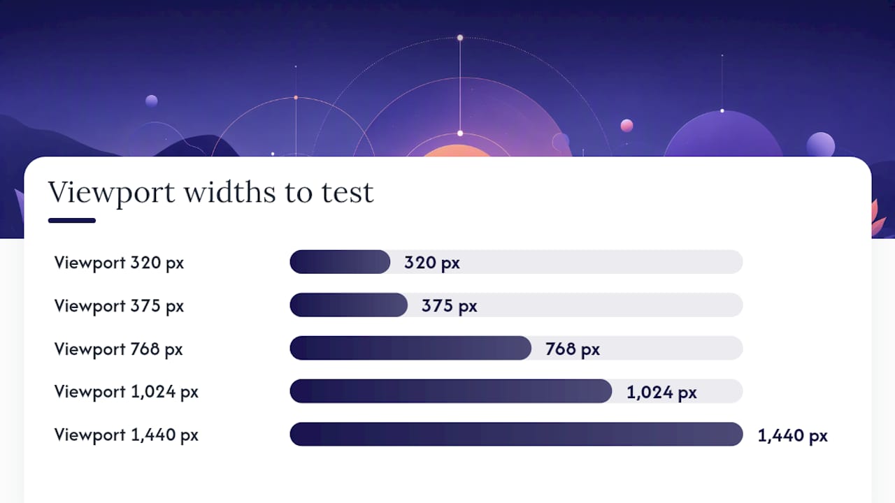
- Viewport widths: 320 px, 375 px, 768 px, 1,024 px, 1,440 px.
- Portrait and landscape orientation on mobile and tablet.
- Font scaling: increase the browser’s default font size to 200% and check that layouts do not break.
- Touch targets: tap every interactive element on a real device or emulator and confirm nothing requires precise tapping.
- Image scaling: confirm no images overflow their containers and that no oversized files are downloaded on narrow viewports (check the Network tab).
- Layout shift: run a Lighthouse performance audit and check the CLS score. Any score above 0.1 needs investigation.
Debugging common issues:
- Horizontal scrollbar — an element has a fixed width wider than the viewport. Use
overflow-x: hiddenon the body temporarily to locate the culprit, then fix the root cause. - Media queries not firing — the viewport meta tag is missing or incorrect. Check
<head>first. - Unexpected scaling — a parent container has
overflow: hiddenor a fixed height that clips content at narrow widths. - Media query specificity conflicts — a later rule in the cascade is overriding your responsive styles. Use browser devtools to trace which rule wins.
For CI integration, run Lighthouse in headless mode via the lighthouse CLI or integrate axe-core into your test suite to catch regressions automatically before deployment.
Accessibility and performance for responsive sites
Responsive design and accessibility overlap more than most developers expect. A layout that works on a 320 px screen is already doing much of the work that assistive technology needs.
Accessibility priorities:
- Touch targets of at least 48×48 device-independent pixels for all interactive controls. Smaller targets cause errors on touch devices and fail WCAG 2.5.5.
- No hover-only interactions. Any affordance triggered by
:hovermust also be available via:focusor a tap, since touch devices have no hover state. - Pinch-to-zoom must remain enabled. Never set
user-scalable=no. - Maintain logical focus order when columns reorder at breakpoints. CSS
orderchanges visual position but not DOM order — screen readers follow the DOM. - Text must meet WCAG AA contrast ratios at all font sizes and on all background colours used across breakpoints.
For a deeper look at how accessibility and SEO reinforce each other, the web accessibility and SEO guide from our partners covers the overlap clearly.
Performance priorities:
- Mobile-first CSS keeps the initial stylesheet small. Desktop-only rules are loaded only when the viewport is wide enough.
- Critical CSS — inline the styles needed for above-the-fold content and defer the rest. This reduces render-blocking.
- Lazy-load images and iframes below the fold with
loading="lazy". - Audit and remove unused CSS with tools such as PurgeCSS or the Coverage tab in Chrome DevTools.
- Serve AVIF or WebP images via
<picture>with a JPEG fallback.
GOV.UK’s service manual recommends combining responsive design with progressive enhancement to provide consistent functionality across browsers and devices, which directly supports both accessibility and resilience when JavaScript is unavailable or slow to load.
For WordPress sites specifically, accessibility in WordPress covers the plugin and theme-level considerations that sit on top of these front-end fundamentals.
Practical layout patterns you can copy right now
These patterns cover the most common responsive scenarios. Each one is small enough to understand in a minute and adapt in five.
Single-column stack (mobile-first):
The default for any content-first layout. Everything stacks vertically at small widths; Grid or Flexbox adds columns at wider breakpoints. Use this as your base for article pages, landing pages, and forms.
Two-column that becomes single column:
.two-col {
  display: grid;
  grid-template-columns: 1fr;
  gap: 2rem;
}

@media (min-width: 48rem) {
  .two-col {
    grid-template-columns: 1fr 2fr;
  }
}
The sidebar sits below the main content on mobile and moves alongside it on tablet and above. Keep the DOM order as main content first, sidebar second, so mobile users reach the content before the navigation.
Card grid that reflows:
.card-grid {
  display: grid;
  grid-template-columns: repeat(auto-fit, minmax(16rem, 1fr));
  gap: 1.5rem;
}
No media queries needed. Cards fill the available width and wrap automatically. Works for portfolios, service listings, and blog archives.
Off-canvas navigation:
On wider viewports, the nav displays inline. This pattern keeps the DOM clean and avoids the performance cost of display-switching large navigation blocks.
- Use
aria-expandedon the toggle button andaria-hiddenon the nav panel to communicate state to screen readers. - Trap keyboard focus inside the open nav so tab does not reach hidden content.
Responsive table handling:
Wide data tables overflow on narrow screens. Two practical approaches: scroll the table horizontally inside a overflow-x: auto wrapper, or reformat rows as stacked label/value pairs using display: block on td elements at small widths.
For ecommerce-specific layout patterns, the visual design for ecommerce guide covers product grid and checkout responsive considerations in detail.
Managing responsive WordPress sites at scale: an agency perspective
For UK agencies delivering WordPress sites to multiple clients, responsive design is not a one-time build decision. It is an ongoing operational commitment. Every plugin update, block editor change, or content edit can introduce a regression that breaks a layout on mobile.
A few operational habits that make the difference at scale:
- Standardise your breakpoint system — document the breakpoints your theme uses and share them with designers and content editors. When everyone works to the same system, bespoke per-page fixes stop accumulating.
- Component-level patterns — build responsive rules into reusable blocks or patterns rather than page templates. When a pattern is updated, every instance inherits the fix.
- Block editor vs classic themes — Full Site Editing (FSE) themes in WordPress 6.x expose responsive controls in the editor, but they also make it easier for editors to override spacing and layout in ways that break on mobile. Governance matters as much as code.
- Responsive QA as part of handover — every site delivery should include a documented responsive QA sign-off covering the viewport widths and orientations tested.
- Content governance — train content editors on image sizing, table use, and embedded media. A 4 MB image uploaded directly to the media library bypasses all your responsive image work.
Wpcto works with UK design and digital agencies to handle the ongoing WordPress delivery that sits behind these decisions: plugin management, security monitoring, performance optimisation, and emergency support. If you are managing responsive WordPress sites for multiple clients and the maintenance is pulling your team away from creative work, it is worth knowing exactly how much uncaptured revenue is sitting in your existing client base.
Use the WordPress Profit Calculator to see what your agency’s WordPress clients are worth in under 90 seconds. It is free, takes no account details, and gives you a clear number to work with.
For agencies ready to hand off WordPress delivery entirely, Wpcto’s agency services cover everything from maintenance plans to fractional WordPress CTO support.
A field-tested perspective on responsive delivery
The technical fundamentals of responsive design are well-documented. What is less often said is that most responsive bugs in client work are not CSS problems. They are process problems.
A layout breaks on mobile three months after launch because a content editor uploaded a fixed-width table in the page builder. A heading overflows on a 375 px screen because the designer signed off on a 1,440 px mockup and nobody tested the intermediate sizes. A touch target is too small because the developer matched the desktop design exactly and the button was only 28 px tall in the comp.
The fix is not more media queries. It is a handover checklist that travels with every project:
- Style guide with breakpoints documented — not just colours and type scales, but the exact viewport widths where layout changes occur and why.
- Responsive QA sign-off — a named person confirms they have tested at 320 px, 375 px, 768 px, and 1,440 px before the site goes live.
- Asset generation process — a documented step for how images are sized, compressed, and uploaded, so the next person to touch the site does not undo the performance work.
When triaging a responsive bug in client work, start with the viewport meta tag (missing more often than you’d expect), then check for fixed-width elements in the CSS, then look at the content. Nine times out of ten, the problem is in one of those three places.
Balancing speed with robustness means building the responsive system once, documenting it clearly, and then protecting it through governance rather than revisiting it on every project.